With the invention of Pantone color-matching systems, life in the ink room has become much easier. As my children say, “back in the 1900s” it wasn’t as simple.
Finding someone with a good eye for color was a must for any busy print shop. One of the tools we found really handy was the color wheel. This could be purchased at most any art supply store and still are available today. Using this tool can help you see the relationship of color and give you examples of how other colors can be used during mixing.
Let’s start with the primary colors: red, yellow and blue. The color wheel will show you how to mix the primary colors to get the secondary colors of orange, green and violet, as well as how to get tertiary colors, which consist of red-violet, red-orange, yellow-orange, yellow-green, blue-green and blue-violet.
The wheel also shows what happens when you tint a color using white to make the color lighter and when you shade using black to make the color darker. Opposite each other on the wheel are complementary colors. To make a color less clean, you can mix in a little of the complementary color. Be careful, though, because by mixing too much you will end up with a muddy or dingy brown color.
In my early days, this was the color I made most frequently and it was usually by mistake. Once I understood complementary colors, I could use this in reverse to revive a clean color from a dirty one or correct my mistakes. As you can see, understanding the relationship between these colors on the color wheel will improve your skills for color matching.
Now, try this in your ink room. Mix several old leftover inks together on a piece of white paper. It only takes a little bit of each for this example. With your finger or a spatula, mix the colors together until you get a dirty or muddy color. Next, take a primary color — yellow, red or blue — and mix with the dirty one. You will see that one of the primaries will clean up the dirty color and revive it to a clean, hopefully usable color. This is a good way to reduce the old leftover colors from the ink room, too.
Kent Hudson is sales director for International Coatings Co. - See more at: http://impressions.issshows.com/screen-printing-process/Match-Colors-Using-a-7713.shtml#sthash.ymJuSrsW.dpuf
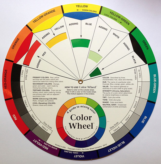
Color Wheel courtesy of The Color Wheel Company
Many of us have heard of or seen a color wheel, but how does it work? What do the values mean? Here is Kent Hudson with a recent article published in Impressions, to shed some light on how to use the color wheel and how to apply it in our everyday print shops. With the invention of Pantone color-matching systems, life in the ink room has become much easier. As my children say, “back in the 1900s” it wasn’t as simple.Finding someone with a good eye for color was a must for any busy print shop. One of the tools we found really handy was the color wheel. This could be purchased at most any art supply store and still are available today. Using this tool can help you see the relationship of color and give you examples of how other colors can be used during mixing.
Let’s start with the primary colors: red, yellow and blue. The color wheel will show you how to mix the primary colors to get the secondary colors of orange, green and violet, as well as how to get tertiary colors, which consist of red-violet, red-orange, yellow-orange, yellow-green, blue-green and blue-violet.
The wheel also shows what happens when you tint a color using white to make the color lighter and when you shade using black to make the color darker. Opposite each other on the wheel are complementary colors. To make a color less clean, you can mix in a little of the complementary color. Be careful, though, because by mixing too much you will end up with a muddy or dingy brown color.
In my early days, this was the color I made most frequently and it was usually by mistake. Once I understood complementary colors, I could use this in reverse to revive a clean color from a dirty one or correct my mistakes. As you can see, understanding the relationship between these colors on the color wheel will improve your skills for color matching.
Now, try this in your ink room. Mix several old leftover inks together on a piece of white paper. It only takes a little bit of each for this example. With your finger or a spatula, mix the colors together until you get a dirty or muddy color. Next, take a primary color — yellow, red or blue — and mix with the dirty one. You will see that one of the primaries will clean up the dirty color and revive it to a clean, hopefully usable color. This is a good way to reduce the old leftover colors from the ink room, too.
Kent Hudson is sales director for International Coatings Co. and has more than 35 years of screen printing and industry experience.