Four Color Process?
May 19, 2010
 Lately we have received some inquiries on how to print 4-color-process (or 4PC), what it’s used for, and what to consider when working on the process. We have tapped industry expert Lon Winters to give us his expertise on this subject:
“At best, any attempt to recreate a piece of art with four color process inks* is pushing the limits. Add to that the many variables in the screen printing process on t-shirts, and you are involved in a process requiring discipline and commitment at the least. Years ago we cut our teeth developing and learning how to print four color process images. At that time it truly separated the good printers from the excellent. Over the last decade or so, with the further development of simulated process and the explosion of special effects printing, the four color specialist has all but been left in the dust like the hand sign painter. But we have good news for you. It’s baaaaaaaaack. More than one major brand is beginning to ask for the four color process type printing again. It is still the best method for absolute reproduction of flesh-containing photos and where we see it now is in water colors and photos of flowers. Typically 4CP has been scary to many but there are some basic steps you can take that are designed to make process printing easier and more predictable on press than one might have heard.
Recently we put on a fabulous two day hands-on workshop for the Ryonet folks up in Washington (Ryonet is one of International Coatings’ distributors). One of the requests prior to the event was to choose, separate and print a 4CP job for the attendees. So that’s what we did. Because flowers are cool, we chose a high resolution photo of a “panzee” (pansy) for the workshop. That and we call each other that when one of us is whimpin’ out at the bar...ehem, we mean on a project. The resolution needs to be at least 150 dpi (dots per inch) but because this is a photo, a 300 dpi to size was way better.
Lately we have received some inquiries on how to print 4-color-process (or 4PC), what it’s used for, and what to consider when working on the process. We have tapped industry expert Lon Winters to give us his expertise on this subject:
“At best, any attempt to recreate a piece of art with four color process inks* is pushing the limits. Add to that the many variables in the screen printing process on t-shirts, and you are involved in a process requiring discipline and commitment at the least. Years ago we cut our teeth developing and learning how to print four color process images. At that time it truly separated the good printers from the excellent. Over the last decade or so, with the further development of simulated process and the explosion of special effects printing, the four color specialist has all but been left in the dust like the hand sign painter. But we have good news for you. It’s baaaaaaaaack. More than one major brand is beginning to ask for the four color process type printing again. It is still the best method for absolute reproduction of flesh-containing photos and where we see it now is in water colors and photos of flowers. Typically 4CP has been scary to many but there are some basic steps you can take that are designed to make process printing easier and more predictable on press than one might have heard.
Recently we put on a fabulous two day hands-on workshop for the Ryonet folks up in Washington (Ryonet is one of International Coatings’ distributors). One of the requests prior to the event was to choose, separate and print a 4CP job for the attendees. So that’s what we did. Because flowers are cool, we chose a high resolution photo of a “panzee” (pansy) for the workshop. That and we call each other that when one of us is whimpin’ out at the bar...ehem, we mean on a project. The resolution needs to be at least 150 dpi (dots per inch) but because this is a photo, a 300 dpi to size was way better.  Artwork and Separation
Before we get to the separations, here is the trick, folks: Contact your ink manufacturer or a distributor for a Photoshop color data disk or download the color values for Photoshop off of their web site. Most manufacturers have this readily available and will take the guess work out of the color value part of your separation. Once we had that info we loaded the image into Photoshop in RGB mode. If you get CMYK art from a customer, you want to convert colors to RGB. We then set our white and black points by converting to lab mode, then the lightness channel and levels. Dragging both arrows sets our black black and white white areas. We created our white base and wet whites here as well. We were going to print on white and very light substrates only so would only need a wet white for the negative space areas and to pastel out the lower end. We decided to make a white base just for kicks though. We duplicated the channel and hit invert box and select curves and drug the left arrow to the right about 10% to simulate a choke. For the wet white we drug the arrow to the right until the color was only in the areas of the image where we want white and pastel colors. Then we converted back to CMYK. We ended up with the CMYK channels and the white channels we just created and changed them to white. We selected our black channel and dialed it back with the arrow to the 25% area as black usually tries to take over the entire image. At this point we made adjustments to color balance, saturation and lightness to kind of dial in what we wanted. In the CMYK Setup and preferences we set in the “printing inks setup” we got from the ink manufacturers website.
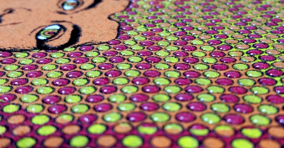
When we went to ink jet output through the RIP we printed right out of Photoshop in separate channels and set our angles to 61 degrees with the frequency at 65 lpi (lines per inch) using an eliptical shaped dot. There was a time when we ran all of our process colors at four different angles to ensure a rosette pattern once printed. We have found over the last few years people are going to all one angle with very good results.
Screens and Printing
Our screens we chose were on N300 tpi (threads per inch) mesh at 45 N/cm2. We avoided all moire and set up with our wet white first, then the yellow and magenta followed by the cyan and finally the black. The inks were standard process inks* straight out of the container except the white, where we chose to cut a standard white 50% with a softhand clear. After a little ink build up on the back of the screens, our purple pansy turned out really nice. We didn’t have much color balance to deal with as no one would ever see the original.
The restless audience was impressed but demanded it be printed on black. We warned that simulated is really the best way to go on black but obliged as we knew that they would insist. Since we were running on a six color auto with one flash we pulled down the wet white and replaced it with the white base using our preregistration system and it lined up perfectly. The white base didn’t have much kick at first since it was on such a high mesh and we had no intention of putting it on a black shirt in the first place. However after a little manipulation and a double stroke followed by the flash and yellow, magenta, cyan and black, we ended up with a really cool look. The audience called it an “emo” flower. And a new look is born. We are looking forward to getting back to the studio to build a line around this concept. Cool ‘eh?
This is only a very basic four color process application. We are lucky that we have been able to bring our art department and production departments together on projects. Communication has been the key. The art department realizes that they support the production area by designing art to be as easy as possible to print on press. They also realize that the press and screens are just more brushes to use to create with rather than a limiting factor. The possibilities are limitless.”
Artwork and Separation
Before we get to the separations, here is the trick, folks: Contact your ink manufacturer or a distributor for a Photoshop color data disk or download the color values for Photoshop off of their web site. Most manufacturers have this readily available and will take the guess work out of the color value part of your separation. Once we had that info we loaded the image into Photoshop in RGB mode. If you get CMYK art from a customer, you want to convert colors to RGB. We then set our white and black points by converting to lab mode, then the lightness channel and levels. Dragging both arrows sets our black black and white white areas. We created our white base and wet whites here as well. We were going to print on white and very light substrates only so would only need a wet white for the negative space areas and to pastel out the lower end. We decided to make a white base just for kicks though. We duplicated the channel and hit invert box and select curves and drug the left arrow to the right about 10% to simulate a choke. For the wet white we drug the arrow to the right until the color was only in the areas of the image where we want white and pastel colors. Then we converted back to CMYK. We ended up with the CMYK channels and the white channels we just created and changed them to white. We selected our black channel and dialed it back with the arrow to the 25% area as black usually tries to take over the entire image. At this point we made adjustments to color balance, saturation and lightness to kind of dial in what we wanted. In the CMYK Setup and preferences we set in the “printing inks setup” we got from the ink manufacturers website.
When we went to ink jet output through the RIP we printed right out of Photoshop in separate channels and set our angles to 61 degrees with the frequency at 65 lpi (lines per inch) using an eliptical shaped dot. There was a time when we ran all of our process colors at four different angles to ensure a rosette pattern once printed. We have found over the last few years people are going to all one angle with very good results.
Screens and Printing
Our screens we chose were on N300 tpi (threads per inch) mesh at 45 N/cm2. We avoided all moire and set up with our wet white first, then the yellow and magenta followed by the cyan and finally the black. The inks were standard process inks* straight out of the container except the white, where we chose to cut a standard white 50% with a softhand clear. After a little ink build up on the back of the screens, our purple pansy turned out really nice. We didn’t have much color balance to deal with as no one would ever see the original.
The restless audience was impressed but demanded it be printed on black. We warned that simulated is really the best way to go on black but obliged as we knew that they would insist. Since we were running on a six color auto with one flash we pulled down the wet white and replaced it with the white base using our preregistration system and it lined up perfectly. The white base didn’t have much kick at first since it was on such a high mesh and we had no intention of putting it on a black shirt in the first place. However after a little manipulation and a double stroke followed by the flash and yellow, magenta, cyan and black, we ended up with a really cool look. The audience called it an “emo” flower. And a new look is born. We are looking forward to getting back to the studio to build a line around this concept. Cool ‘eh?
This is only a very basic four color process application. We are lucky that we have been able to bring our art department and production departments together on projects. Communication has been the key. The art department realizes that they support the production area by designing art to be as easy as possible to print on press. They also realize that the press and screens are just more brushes to use to create with rather than a limiting factor. The possibilities are limitless.”  *International Coatings’ line of Pro-Brite™ Inks are part of our 700 Series. The products used for printing 4CP are 724LF Pro-Brite™ Yellow, 743LF Pro-Brite™ Magenta, 764LF Pro-Brite™ Cyan and 784LF Pro-Brite™ Black.
 Lon Winters is President of Print This, Inc. as well as President of Graphic Elephants.com. Lon is a print expert with knowledge from plant design to print processes to graphic design execution. His impressive portfolio includes consulting, teaching, and managing state-of-the art print facilities for major corporations. Lon publishes numerous articles and monthly columns and has served as an honorary Golden Image Judge for over 10 years.
For more on Lon, visit www.GraphicElephants.com or you can reach him at: lon@graphicelephants.com or 303-910-0477.
Lon Winters is President of Print This, Inc. as well as President of Graphic Elephants.com. Lon is a print expert with knowledge from plant design to print processes to graphic design execution. His impressive portfolio includes consulting, teaching, and managing state-of-the art print facilities for major corporations. Lon publishes numerous articles and monthly columns and has served as an honorary Golden Image Judge for over 10 years.
For more on Lon, visit www.GraphicElephants.com or you can reach him at: lon@graphicelephants.com or 303-910-0477.